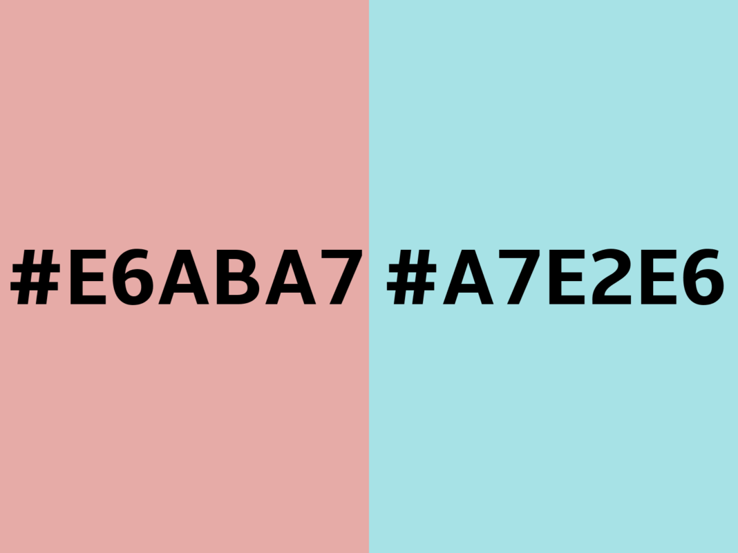
Colors hold significant power in the world of design, branding, and aesthetics. One such unique shade is E6ABA7, a soft, pastel-like pink that exudes warmth and sophistication. This color, often associated with tenderness and subtlety, can be a powerful element in design when used effectively. In this article, we will dive deep into the world of E6ABA7, exploring its psychology, usage, and how to integrate it into your projects for maximum impact.
1. Understanding the E6ABA7 Color Code
E6ABA7 is a hexadecimal color code used primarily in digital and graphic design. It represents a light pink hue with the following composition:
- Red: 230
- Green: 171
- Blue: 167
In the RGB color model, E6ABA7 creates a soft pastel tone that is neither too bold nor too muted, making it versatile for various applications. When converted to HSL (Hue, Saturation, Lightness), this color has:
- Hue: 5° (close to red)
- Saturation: 59%
- Lightness: 78%
This gentle combination makes it an excellent choice for creating calming and inviting designs.
2. The Psychology Behind E6ABA7
Colors have a profound psychological impact, influencing moods and perceptions. E6ABA7, with its soft pink tone, evokes:
- Warmth and Affection: Its pastel nature communicates care and kindness.
- Femininity and Grace: Often associated with traditional feminine attributes, this color is elegant and delicate.
- Calmness and Serenity: The muted tone has a soothing effect, making it ideal for stress-free environments.
- Romantic and Nostalgic Feelings: E6ABA7 can invoke a sense of nostalgia and romance, making it perfect for vintage-themed projects.
Understanding the emotional resonance of this color helps designers and marketers harness its full potential.
3. Where E6ABA7 Fits in Design
E6ABA7 is a highly versatile color that fits well in various design contexts:
- Fashion Design: It is popular in clothing, accessories, and even makeup palettes for its sophisticated look.
- Graphic Design: From brochures to posters, this color creates a harmonious and engaging visual experience.
- Digital Art: Artists often use this hue to bring softness and warmth to their creations.
Its adaptability across diverse design sectors makes it a go-to color for professionals seeking elegance.
4. E6ABA7 in Web Design
In web design, choosing the right color can significantly impact user experience. E6ABA7 works exceptionally well due to its calming and welcoming attributes. Here’s how you can use it:
- Backgrounds: A soft E6ABA7 background can make content stand out without overwhelming the user.
- Buttons and Call-to-Actions (CTAs): Pair it with bold colors for clickable CTAs that attract attention.
- Headers and Subheaders: Use this color in typography to create a visually pleasing hierarchy.
Accessibility Tip
When using E6ABA7, ensure enough contrast with text for readability. Pair it with darker shades like charcoal gray or navy blue.
5. E6ABA7 in Branding and Marketing
Brands aim to establish an emotional connection with their audience, and colors are key to achieving this. E6ABA7 can help brands:
- Establish Trust and Warmth: Its pastel tone is inviting, creating a sense of reliability.
- Appeal to Female Audiences: This color often resonates with women, making it a favorite for beauty and wellness brands.
- Showcase Sophistication: Luxury brands can use E6ABA7 to convey elegance and exclusivity.
Example: Think of a skincare brand using E6ABA7 in its packaging to reflect softness and care.
6. Combining E6ABA7 with Other Colors
Pairing E6ABA7 with complementary colors can elevate its impact. Here are some combinations to consider:
- Neutral Tones: White, beige, and gray for a minimalist look.
- Contrasting Colors: Navy blue or emerald green for bold contrasts.
- Analogous Colors: Shades of red and peach for a harmonious palette.
- Metallics: Gold and rose gold for a luxurious appeal.
Pro Tip
Use tools like Adobe Color to explore complementary and analogous color palettes for E6A BA7.
7. Using E6A BA7 in Interior Design
In interior design, E6A BA7 can transform spaces into serene and stylish environments. Here’s how:
- Wall Paint: Create a soft, warm ambiance in bedrooms or living rooms.
- Furniture and Decor: Incorporate this color in cushions, curtains, or accent furniture for a chic look.
- Nurseries: Its calming effect makes it ideal for baby rooms or play areas.
Design Tip
Balance E6A BA7 with neutral colors like white or taupe to avoid overwhelming the space.
8. Creating Mood with E6A BA7
Colors play a vital role in setting the mood of a design or environment. E6A BA7 excels in creating:
- Romantic Settings: Use this color for weddings or intimate dinner events.
- Relaxed Atmospheres: It’s perfect for spas or wellness centers where tranquility is paramount.
- Playful and Youthful Vibes: Pair it with brighter hues like mint green for a cheerful setting.
9. Conclusion: The Timeless Appeal of E6A BA7
The E6ABA7 color offers a unique blend of warmth, elegance, and versatility. Whether used in web design, branding, or interior decor, its soft pink hue can elevate any project. By understanding its psychological impact and effective applications, you can harness the power of E6A BA7 to create designs that resonate with your audience.
From creating a calming digital presence to designing stylish interiors, E6A BA7 is a timeless choice for those seeking subtle sophistication. Incorporate this beautiful hue into your next project and experience its charm firsthand.
